Tokyo Design Week 2008
Design week. Whether you love it, hate it, or couldn’t care less, you would have noticed that last weekend Design Week was all over central Tokyo. And it definitely necessitated an entire holiday weekend: with main venues in both Aoyama and Roppongi, plus satellite exhibits and parties planned for boutiques, galleries, and cafés from Harajuku to Ginza, the ambitious event cast a wide shadow over the city, covering aspects of interest to everyone from industry professionals to the simply curious.
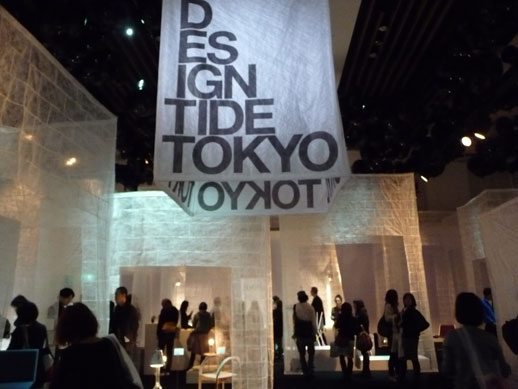
For novices, the easiest entry into the world of contemporary design was through Design Tide, an exhibit of over thirty individual designers and firms, both domestic and international. Overall, the works, generally prototypes, effectively revealed new ways of looking at form, space, light, time — I don’t know if this is particular to harried Tokyo, but there were a disproportionate number of clocks on display — and increasingly, the reuse of materials. Design at its best is perhaps the most immediate and concrete means for accessing these concepts, reminding us of the infinite possibilities for cultivating our personal and collective style of living.
This year’s edition seemed more contemplative and noticeably less gimmicky than last year’s installment, where the most memorable piece was an alarm clock controlled by a vintage Nintendo controller. The previous year’s slogan “Play = Communication” had drawn criticism, notably from Nick Currie (aka Momus) on his Click Opera blog, where he prompted an on debate among the English-speaking Japan watching/residing world. Worth a read, as is coverage on PingMag and Néojaponsime, for a primer on the different angles one can use to approach the current cult of design.
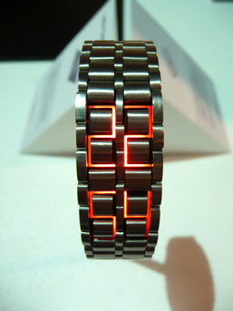
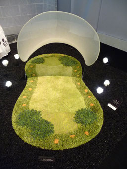
Gimmickry, it must be noted, has its charm and without its catchiness I am hard pressed to nail down this year’s Design Tide stand-out entry. 100%’s faceless watch for its cool technology assimilation? Emmanuelle Moureau’s brutal “Stick chair” or the delicate rocking horse clocks by Tomatsu Koshima? How about On Ground’s clever personal, canopied “park” cum floor rug?
![Photo: RM Tamotsu Koshima, 'clock [klák]'](http://www.tokyoartbeat.com/tablog/entries.en/wp-content/uploads/2008/11/tokyodesignweek4.jpg)
All of this unfolds in the sealed-off, soundproof chamber that is the event hall at Tokyo Midtown, with individual displays housed in semi-sheer tents, illuminated by spot lighting, and set to some very Midtown-esque ambient music. I want to dislike Tokyo Midtown, but I also have to concede that the luxury super-mall does regularly hold exhibitions that are noteworthy both in content and for an advertising scale that draws substantial interest from a public that otherwise might not care.
Down the hall in the atrium there is also Design Touch, a display of works from iconic creators (such as a Marc Newson bicycle and a Taro Okamoto couch) that ends in an auction—a reminder that those who shop (and live!) in Midtown can actually afford to buy these pieces. It is then, perhaps, a fitting location, though I missed the ad-hoc roughness of last year’s venue, a tent under the stands of the National Stadium. Though I didn’t miss the cold.
Meanwhile Design Tide’s city canvassing, treasure hunt-like “Extension” rewarded the diligent and made up for the soulless venue of its parent event. Exploring the loose collection of participating spaces—the aforementioned boutiques, cafés, and galleries—required substantial legwork and scrutiny of map, a readiness for getting lost. However, after circling the block for twenty minutes to find your target, you might be rewarded with an awesome exhibit presided over by the designer him or herself, or even a sofa showroom, with the chance of a glass of sparkling wine or a macaroon to compensate your effort.
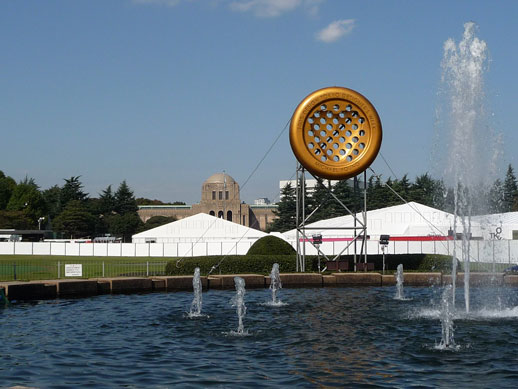
On the other hand, if it is an expansive, less-edited though happily contained look that you are after, there is 100% Design, held outside the Meiji Memorial Picture Gallery at the end of the famous Ginko tree-lined avenue in Gaienmae. It is important to note, however, that 100% Design is more of industry tradeshow that masquerades as an innovative public exhibition, meaning that it comes off as more commercial, and less ground-breaking, then one might expect for the event that has become synonymous with Tokyo Design Week. Nevertheless, the very fact that the public is invited can be seen as a nod to the consumer’s powerful role in making design the phenomenon that it is today.
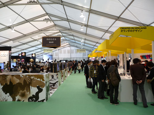
The theme for this fourth edition (since the 23 year-old event morphed into its current form) is “Love,” emblemized by the “Love Button” icon designed by creative director Michael Young. It is a theme that remains unclear in its execution and the show is marked more for cleverness (a chandelier made of cutlery) and craftiness (a cashmere sweater for your kitchen chair), than any revolutionary new aesthetic.
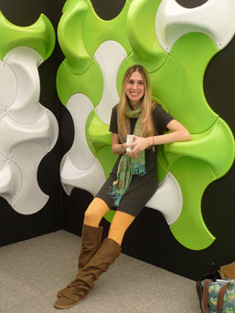
Meanwhile the main floor was spread out inside three tents, the main one being organized into a sort of “It’s a Small World” of design. Countries as diverse as South Korea and Canada were represented, though of course there was a heavy presence from Scandanavia. In general, the works were in line with the times: employing unmuddled colors, transparent and home-spun materials, airy skeletal structures, smooth light wood, and recycled elements to the extent that anything to the contrary comes off as heavy and unnecessarily deluxe, though I’ll make an allowance for the stainless steel bath shaped like a champagne bucket.
For design fans and moreover design professionals who might find inspiration among the work, the draw lies in the possibility of encountering an innovative chair, marveling at the execution of a seemingly weightless structure, or seeing something typically hard made delightfully soft. At this uncomplicated level, there is much to be gleamed from 100% Design.
I must vent, however, that for an international event, the haphazard application of language was appalling: some booths were only in Japanese, others only in English, and still some (ditto the Design Tide program) used garbled English that is insulting to both the designers and the guests. For visitors looking for help negotiating between those two main languages, the gracious NPO Heartful Japan (located at the back of the retail area because they were also hawking Toyo Ito designed t-shirts) offered free translation services.
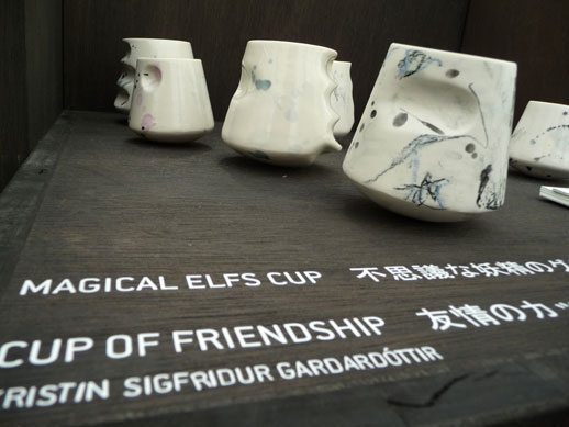
Speaking of retail, both 100% Design and Design Tide do have killer markets (then there are all the boutiques in Extension) and there was certainly plenty to be coveted in and around the festivities. It was while browsing the souvenir stalls that I discovered what might be, for me, a way to draw that tricky and ambiguous line between art and design: no matter how much I fall for a work of art, that affinity has nothing to do with wanting to posses it. But those “Magical Elf Cups” by Studio Subba from the Trade Council of Iceland display? I couldn’t help but appreciate them, in part, by imagining them sitting on my kitchen table filled with hot cocoa. Or maybe it was just cold and time for me to go home.
Rebecca Milner
Rebecca Milner


