Takuma Hayashi’s “Figurative and Abstract” at Nadoya Ebisu
Identifying itself as both venue and a concept, Nadoya asserts itself as a fugitive art space. Eluding clear definition, it slips into violet shadows, somewhere between a gallery and an architectural aggregation, the sum of its past histories. Discoverable within a partly renovated kominka house in Ebisu, it sits quietly, just beyond a small and tidy car park, surrounded by taller apartment blocks, its back to the trees. Likewise, the art it presents has to be looked for among the palimpsest of layered histories, with layers and narratives jostling for or hiding from attention. The result is a space for nuance and subtlety; every detail could be the art, or not, as it could also be merely a remnant of another time, another use. Like the light switches. I really liked the light switches. Paradoxically the effect is to sublimate the art and to magnify the ordinary, which is so much unlike a white cube gallery experience. As a visitor you need to look hard, and once you do, it rewards you with an experience beyond looking.


Nadoya is currently featuring the work of Takuma Hayashi in “Figurative and Abstract”. Echoing the functional fluidity of the space, the artist asks questions of the relationship between what is abstract, concrete or figurative. While these terms may have specific meanings in art history, here at Nadoya those ideas seem far more open to elaboration. Or they may be relegated to their plain and ordinary meanings, which is refreshing. Takuma is a graphic designer and describes his design process and the exhibition itself as “an attempt to visualise the relationship” between these concepts.
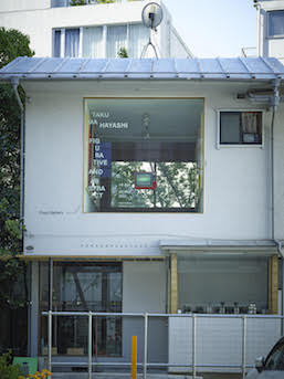
One of the more striking features of the architectural renovation from kominka house is the fuyu, or floating gallery, created by the removal of a large section of the street-facing façade. In its place, a square glass window enables a simultaneous looking out / looking within. Setting aside for a moment the intriguing connection to the Renaissance idea of a window as the classic dichotomy of a painting (1), for this exhibition, suspended centrally is a television set. I don’t mean the ubiquitous flat screens of our age but a retro model; a boxy little red tv with knobs. Look along and there are more: four tvs can be seen nestled into windows or occupying cantilevered boxes, facing the street as windows. Cumulatively, they eye the streetscape. Like an amalgam of object diorama and painting they evoke a sense of the fierce still life of objects, and the early still life works of Vija Celmins (2) come to mind.

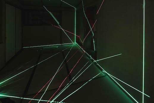
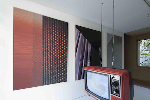
On the day I went, I felt a little like a stranger at a party. There was a notable fragrance of wine in the air, which was filled with an excited chatter in which I could only catch occasional words and phrases. Once inside, the tv screens and an upstairs room display video installations collectively titled Colour of the Emotion (2020), a cycle of 80 images. Viewed as projections in the panelled and sectioned tatami room, split with laser light beams, the effect is of fractured planes, cascading colour and a multiplicity of geometric patterning. This sets the context for a series of framed wall prints, Figurative and Abstract #1-4, a sophisticated morphing of image and physicality. As photographs, they reference contemporary iconic architectural designs but as surface details. The transformation from abstract to concrete is realised as images become plates, but particularly so in #5 and #6, which appear to be infinitesimally pleated to create a precise, architectonic folding of the surface. Achieved through an ink-layered printing technology, it is as if an abstract meditation on materials has become materially embedded. While upstairs I am more than momentarily distracted by a book collection in a corner that features Donald Judd (3). I like his plain writing, and admire his inordinate if rather puffed-up certainty. I recall one of his statements about the main thing wrong with painting and I think about those rectangular frames on the wall nearby and the way they rupture the rectilinearity of the frame. From upstairs I make use of another window, a sliding one at rear, looking into a fruiting tree and a lush green courtyard below.
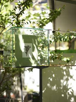
There in that garden, placed among the plants and continuing inside, are a series of works based around books. These are books designed by Hayashi in his work as a graphic designer. Some books are presented as if memorialised inside glass cubes, and this alienation from shelf or hand enables them to take on a new life as objects. Unmoored from function as a readable thing, their titles and cover designs offer an opportunity for discourse by what appears to be free association with other ordinary objects lent meaning by association; a rough stone for Alberto Giacometti, a length of red string for Chiharu Shiota, a framing of living leaves for Terri Weifenbach (4). The last book title, by the way, is The May Sun and on the day I saw it, it was indeed lit by the dappled light and shadow of the May sun. I looked up the book later online and read that Wiefenbach is a flower photographer, and among other things was inspired by the same book of pressed flowers, a copy of which I have at home, inherited from my grandfather. How unexpectedly intriguing life and art can be.

Hayashi’s conception of the life of things, as gradations between figurations and abstractions, lends an insight into the work of a designer and artist, where concepts enter a process to become products. This exhibition poses these questions in a space that is similarly nuanced; taking visual delight in positioning art as objects as well as sources of contemplation. As an alternative to a traditional gallery, the venue found at Nadoya is surely one of the most enjoyable ways to view contemporary art and introduce artists, as it so disarmingly presents art in relationship with a context beyond conventional norms of display and market.
(1) Leon Battista Alberti, De Pictura (On Painting), 1436: “First of all, on the surface on which I am going to paint, I draw a rectangle of whatever size I want, which I regard as an open window through which the subject to be painted is seen.”
(2) Vija Celmins, US (born 1938, Latvia)
(3) Donald Judd, Specific Objects, 1965: “The main thing wrong with painting is that it is a rectangular plane faced flat against the wall”.
(4) Alberto Giacometti: Collection Fondation Marguerite et Aime Maight, Exhibition catalogue (2017), Chiharu Shiota: The Soul Trembles, Exhibition catalogue (2019), Terri Weifenbach: The May Sun, Exhibition catalogue (2017), cover designs by Takuma Hayashi.
Lisa Pang
Lisa Pang


