Six Ways “2007 ADC” at GGG could be Improved

Award shows are tough to get right. They have no over-arching narrative, no common aesthetic, and enjoyment by the general public is only one of their purposes. But they are also a great opportunity to put the current thinking and values of an industry on display, improving awareness of how design works, and when it’s working.
The ADC and Ginza Graphic Gallery could be doing a lot more to embrace this opportunity. Here are a few suggestions on how:
1. Improve the lighting.
The GGG has been poorly lit for as long as I’ve been going there. The rooms are too dark, and objects are lit inconsistently. Most of the posters glow in the clarity of dedicated spot lighting, but the books sulk in their low-contrast display cases.
2. Improve the signage.
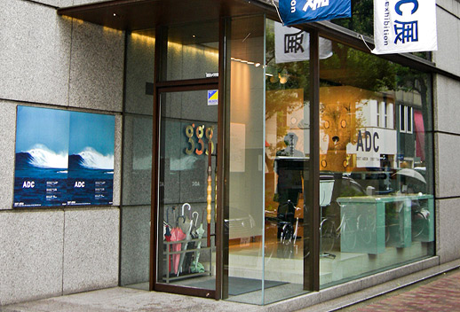
From the street in front of the GGG, you can see 4 pieces of signage:
* The event poster, beautifully composed but sadly lacking in explanation of what the event’s about
* Three bronze geometric lower case g’s, with no indication of what they stand for in English or Japanese
* Vertical cloth banners that say Art Directors Club 2007 in English
* Dark blue sticker type on the clear glass facade of the GGG, sitting in no contrast against the sadly under-lit interior
The message to pedestrians? This exhibition is for those who know our acronyms and printed out the map at home. No passer-bys welcome.
3. Provide context.
Design has made big gains in the public consciousness in the last few years, but too few non-designers have enough familiarity with design’s purpose and process to determine why a particular object has been chosen for distinction and whether it deserves that distinction.
An exhibition like the ADC could do a lot more to put non-designers in the know. How about accompanying each piece with a 50-word project brief?
4. Don’t show old work.
This is the *2007* ADC exhibition. Why are they exhibiting flat plastic flower vases that have been around at least 3 years?
5. Set stricter baseline standards.
Some of the work at this exhibition is both technically sound and beautiful. But some are only one or neither. One prominently displayed packaging piece had a paragraph of full-justified text with gaping holes between words, clearly left that way out of ignorance and not as a effect. I know criticizing Japanese designers for their English typesetting is pedantic, but this is the ADC. Can’t I expect better?
6. Surprise us.
Shiseido, Uniqlo, Softbank, Suntory, United Arrows. Do these companies really need or deserve recognition year after year? Yeah, the Softbank Pantone phones themselves are something, I could see why you would want them in your exhibition. But this is Art Direction, not product design, and the subway posters of Cameron Diaz on white are as unremarkable as advertising can get. The only explanations left for their inclusion are sloppy vision or chumminess.
It’s no accident that the GGG attracts some of the most interesting designers working today; there are few galleries in the world as dedicated to graphic design as GGG. I feel lucky to have it here in Tokyo, and hope to see them move beyond the simple hanging of work, engage the greater public and tell the story of graphic design.
Chris Palmieri
Chris Palmieri


