Keeping It In the Family
Diener & Diener is a family firm named for its current head, Roger Diener, and his father Marcus, who founded the office in the 1940s. Yet while many family practices remain small, focusing on designing houses for wealthy private clients, these architects have a deep commitment to the public realm that shows in their work.
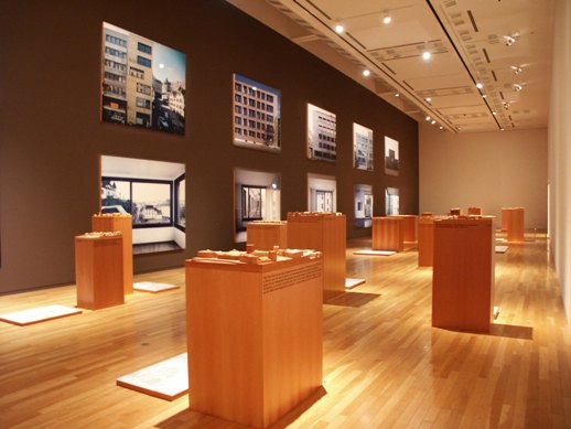
Typically, designers choose to represent their projects as perfect, isolated, and without urban context, but Diener & Diener favors the opposite approach. In fact, on walking into the exhibition hall you may be confused about what exactly is being exhibited. The darkened first room is filled with rows of solid-wood models contrasted with the color-saturated large-format photographs lining the walls — photographs gorgeous enough to merit their own show. Each of Diener & Diener’s projects is shown in its context, surrounded by traffic lights, streets, and sidewalks as well as by other buildings in various states of decay.

But of course, the pictures aren’t the point; the buildings are. Architecture exhibitions are always a bit difficult as what’s on display is not the finished product itself, but rather a representation of it. The chosen mode of representation can reveal a lot about a firm’s ethos. In this show, the models and the photographs share a certain humbleness, a refusal to privilege the firm’s work above that of other builders and designers.
The house and the city: the exhibition vacillates between these two poles of private and public, individual buildings and the larger practice of making places, neighborhoods, towns. Any good architect is required to work at multiple levels of detail simultaneously, from the scale of the structure and how it will fit into its environment to the scale of the human hand and how it will feel on a particular door or window pull.

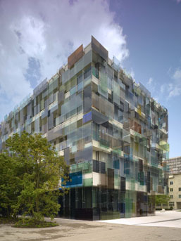
In many projects, the architects show a special sensitivity to the ways in which materials can support design choices. A building in Berlin gets a cladding of channel glass echoing the nearby river; a bright-red box of a museum is flooded with light through a glass-finned clerestory; a gray, blank facade distinguishes the addition to a highly decorated historic structure; a high-ceilinged library can be reconfigured by drawing a set of jewel-colored curtains. Clearly this office is not tied to a signature style (as compared to, say, Richard Meier’s white boxes or Zaha Hadid’s swooping forms) but instead seeks to find the best solution to each design problem as it arises. In one of the exhibition’s rooms, the designers’ logical approach is demonstrated by a series of material tests that were undertaken to find the appropriate brick for a project; it’s an unglamorous process that is familiar to architects but rarely revealed to the public.
The gallery’s promotional leaflet asks, “Is the view from my window part of my room? Will our memories be part of our city?” The answer, according to this firm, is a resounding yes.
Jessica Niles DeHoff
Jessica Niles DeHoff


