Hisui Sugiura’s Japanese Modernism
Hisui Sugiura (1876-1965), one of Japan’s most gifted graphic designers, was heavily influenced by Art Nouveau and Art Deco. His wonderful works have left long-lasting marks on the evolution of modern design from the prewar era through today. Running through November 14th, Sugiura Hisui: Epoch-making Modern Design is presented at the Tobacco & Salt Museum in Sumida Ward. The exhibition hall is small, but showcases approximately 300 works including posters, book and magazine covers, packages, postcards, sketches, and photographs. Many of the exhibits come from The Museum of Art, Ehime, a facility in Sugiura’s home prefecture that holds a collection of about 7,000 items by the designer.
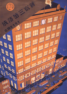
Sugiura is best remembered as the artistic brain behind Mitsukoshi Department Store. He started work at the luxury goods purveyor in 1908. After two years, he became the first head of the design department. His career at Mitsukoshi had spanned 27 years. He was largely responsible for signboards, posters, and covers for PR publications. The poster Shinjuku Mitsukoshi completed, opens October 10 (1930) presents an image of the store superimposed on the bustling Tokyo metropolis. Dual tones of blue and orange on the building, cars, and people on the street make for a striking graphical composition. Many of Mitsukoshi’s publication materials reveal Sugiura’s particular use of color and stylish simplicity.
The artist’s previous study of Nihonga painting almost certainly influenced his portraits of women, flowers, birds, and animals. He firmly believed in designs originating from close observations of nature. He remarked, “Design must be based on the sense of individuality that emanates from natural instruction.” The exhibition displays exquisite woodblock prints of seasonal flowers from the collection Hisui’s Album of 100 Flowers. Poppies, roses, peonies, lilies, magnolias, and other beautiful flora are drawn in delicate lines and soft, subtle hues.
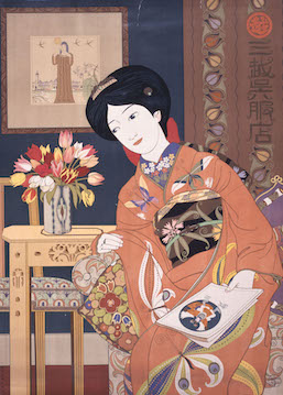
Mitsukoshi Gofukuten: Show of New Spring (1914) is regarded as Sugiura’s masterpiece. An Asian woman with butterflies on her kimono sits beside a vase of flowers in a decorative interior that illustrates the modern lifestyle of those days. The scene incorporates both traditional and Western ambiences.
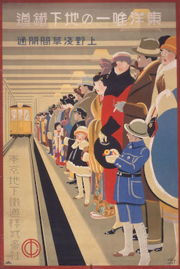
One of the eye-catching highlights in the show is the poster Asia’s First Subway Begins Operation Between Ueno and Asakusa (1927). One quickly notices the brilliant mix of colors in the winter clothing of the train passengers, despite the season usually calling for dark fashion (black, brown, or grey). This irony reflects the emergence of new color perspectives in society. Additionally, the people standing at the rear end of the line are mostly dressed in kimonos, while those conspicuously at the front wear a mix of traditional and Western fashion. This captivating scene emphasizes Japan’s gradual adoption of Western trends. It also indicates Sugiura’s designs progressively evolving from the graceful Japanese style to clearer, bolder, and sharper Western techniques, especially after a trip to Europe. The poster, recognized for its daring and linear composition, was said to represent modern Japanese graphic design with a tinge of Art Deco. It expresses Sugiura’s concept of “universal clarity” and conveys the momentousness of opening the first subway in Asia, a symbol of Tokyo’s recovery from the Great Kanto Earthquake of 1923.
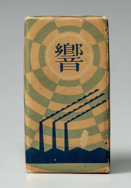
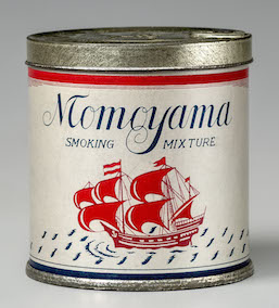
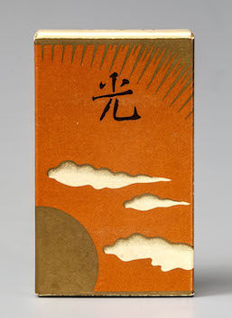
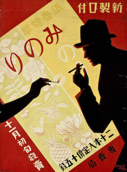
In terms of packaging design, Sugiura was commissioned as a contract designer for the Monopoly Bureau of the Ministry of Finance in 1930. This enabled him to design fancy cigarette packages for the tobacco brand Hibiki (1932), followed by Paloma (1933), Momoyama (1934), Hikari (1936), Fuso (1938), and Nikko (1949). The poster New “Minori” Mouthpieced Cigarettes (1930), which announced the release of the Minori brand, chicly illustrates the actual cigarette package in an angular position with black silhouettes of a woman’s hand extending a lit match to a man’s cigarette, all against a deep red background. The striking colors and simple, straightforward harmony in this ad embody Sugiura’s creative ingenuity. For more retro cigarette package designs, visitors can also view the permanent display about the history of tobacco.
Discovering the richness of art in the graphics of the past shows us how designers such as Sugiura prioritized aesthetics and creative expression. This tendency contrasts with today’s direction in advertorial design, which is overwhelmingly shaped by economic constraints, standardization, convenience, and certainly, digital technology.
Alma Reyes
Alma Reyes


