Gallery 3 – A Triangular Triumph

Gallery 3 has been seamlessly added to 21_21 Design Sight’s two existing galleries in celebration of the Roppongi design hub’s tenth anniversary. The purpose of the new site opened to the public on March 31st, 2017, is the implementation of more experimental programs with international corporations, schools, and other cultural institutions. The original idea of 21_21 Design Sight came from fashion designer Issey Miyake’s discussion with Isamu Noguchi and Tadao Ando about the importance of establishing a Japanese museum just for design. Their talk resulted in an open newspaper editorial written by Miyake that got the project to where it is today. The venue’s name itself imbues a sense of truly observing design – while writing this I kept making the mistake of using “site” instead of the more symbolic “sight, which is of course perfected with 20/20 vision. Genuinely great design is something that becomes so intuitive we often don’t notice it in our everyday lives, even with perfect eyesight.
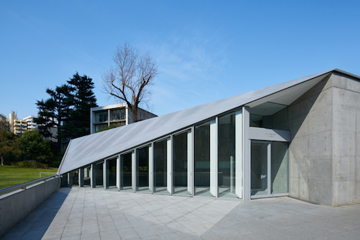
Gallery 3, like the other two spaces, was designed by Tadao Ando. The inspiration for the trio of galleries came from the now-famous concept “A Piece of Cloth,” introduced by Issey Miyake as his approach to fashion. It was Ando who then came up with the idea of turning a piece of triangular iron cloth into a 54-meter steel plate as the slanted roof. The iron cloth is aligned with the existing cedar tress in the back of the museum, offering pure visual cohesion. Eighty percent of the total floor space is underground. On paper the design seems simple, but the actual construction was reportedly a process. Gallery 3 is the smallest of the galleries and appears prime for talks and workshops as a much more intimate space than the other two. It also has the distinction of placing its main space above the ground, offering more exposure to passersby.

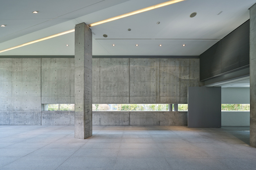
Geometric patterns reign on the inside as on the outside of Gallery 3. The triangle, matched in the roofline and the reception desk, is the dominant shape that greets the visitor upon entry. Walking in, you see a contour in the roofline that runs parallel with a row of circular lights and a line of opaque glass, allowing for natural light that subtly guides you through the space. The back walls both have rectangular slots – one serving as a window and the other made of the same opaque material, letting in natural light that brightens the backside of the building. The angle of the triangular rough line is optically deceiving, giving the space a broader feel than its reality. To much amusement, during the March 30th press preview for the space, 80% of the speakers bumped their heads when walking along the slope. However, this uneven feature still feels relatively balanced thanks to Ando’s details.
Tailored to the design aesthetic, the staff all wore Issey Miyake outfits using the same pleated material that was the inspiration for “A Piece of Cloth.” The line detailing on both the clothing and the “iron cloth” complimented each other to the keen eye. Along with the opening of Gallery 3, the museum has initiated a membership program for individuals or couples that offers unlimited access to the museum for the duration of the year. Open conversations will be held every Friday in Gallery 3 from 17:00 to 19:00. In all, there are a lot of exciting things to come from 21_21 Design Site, including Grand Projects: How Far Will You Go?, a new exhibition about daring design that opens Friday, June 23rd.


