Decades of Design Excellence

In the last fifty years, Design and Art Direction have gone from a small, UK-centric organisation to a globally recognised force in the creative industry. “The Beautiful Black List” sees the D&AD Awards returning to a familiar venue, the Advertising Museum Tokyo in Shimbashi, for a three-month run. The Award’s iconic Yellow Pencil has been awarded to hundreds of talented designers; while their highest honour, the Black Pencil, is only given out to creators of “unimaginable, thought-provoking and truly groundbreaking” work, as the Ad Museum president puts it.
The exhibition covers all of Black Pencil winners from the 1963 – 2012 period, as well as a large selection from the D&AD 50 book, hand-picked by the D&AD presidents. To bring it right up to date there’s also a section dedicated to the winners from this year’s awards. Japanese designers have been well-blessed with awards from the D&AD over the years, so it’s no surprise that the NPO is back in Tokyo to celebrate five important decades of award-winning design.

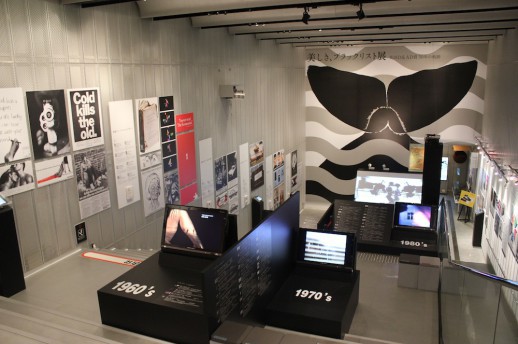
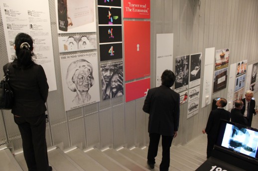
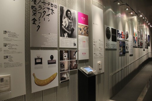
The work in the Ad Museum’s Grand Hall is displayed by theme, which works rather better than a simple timeline approach. Themes include the automobile industry, outdoor advertising, the tobacco industry and Japanese design amongst others. Throughout the years, awards have been given to a variety of media; some traditional, like newspapers and magazines; and some more unexpected, like coinage, music videos and even postage stamps.
As viewers descend the steps, there are five video screens in the venue, each playing looped footage of award-winning advertisements from a particular decade. The opening credits to Goldfinger (Eon Productions 1965) look as impressive as ever; while the very first Black Pencil winner, Shell’s TV advertisement from 1963 is a painfully long, meandering piece that you’ll want to stop watching almost as soon as you’ve started.

Looking around the exhibition there is a growing feeling of just how easy it could be for these designs to be taken for granted. Take the first Channel 4 ident for example, created in 1983 by Lambie-Nairn. It’s something I’d seen hundreds of times during my childhood, but it wasn’t until this show that I actually understood what a hugely influential design it was. Similarly, I’d never stopped twice to look at the FedEx logo, displayed in the ‘Beautiful Design’ section. Only now, after almost twenty years, am I encouraged to really look at it, and find what exactly makes it a great logo design.
Other designs provoke thought about social issues. Over the years the D&AD have honoured both pro and anti-smoking advertising for their contributions to design. And for those too young to remember it, there’s even some award-winning, televisual tobacco advertising in the form of Benson & Hedges’ Swimming Pool from 1979.
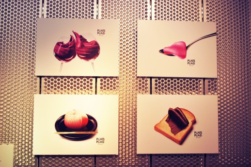
In the second basement floor visitors will find the section dedicated to the winners of the 2013 D&AD awards. This year there were four Black Pencil awards as well and hundreds of Yellow Pencil awards from both the Professional and New Blood Awards (the new name for the Student Awards). Plenty of work to enjoy, including some outstanding pieces from Japanese creatives. Issey Miyake’s PLEATS PLEASE collection is a thing of beauty in itself, so it’s a pleasure to see Taku Satoh’s equally creative Happy Anniversary posters. Both the Jelly Fish Book by Nippon Design Center and Yayoi Kusama’s Louis Vuitton collaboration deserve a closer look, but sadly they were only displayed behind glass.

With so much media in the information age, it’s easy to become short-sighted in terms of design inspiration. What “The Beautiful Black List” shows is that great work from decades ago can continue to inspire, and those who continually strive for excellence can achieve it.
Paul Heaton
Paul Heaton


