Architectural Funhouses
For several years now, architecture has been one of the most crowd-pleasing genres in the Tokyo museum circuit. What used to be a very technical and esoteric discipline for professionals has turned into an exciting source of fun. Forget the boring exhibitions of old: going to an architecture show now is akin to entering a funhouse in which the usual drawings and models are overshadowed (sometimes replaced entirely) by pictures, videos, computer graphics, even small- and big-scale reproductions of actual buildings. They are hands-on laboratories where the public can experience first-hand all the technical, logistic and artistic work that goes into a project.

At the same time, there are people who think that, instead of using architecture in order to attract huge crowds, museums and galleries should concentrate on art. Maybe that’s why there is relatively little traditional architecture on display at the aptly named “Where Is Architecture?” exhibition at the Museum of Modern Art.
We start with Ryuji Nakamura’s intricately built grid-like structure which vaguely resembles a model for a building (or a beehive, or whatever your imagination may suggest) but leaves us in the dark about its purpose (lack of explanation throughout the exhibition is a particularly sore point).
Hideyuki Nakayama’s installation – a couple of “magic doors” limiting an area otherwise covered with assorted textile samples and Lilliputian chairs – is closer to conceptual art than architecture. The same thing can be said about the space Hiroshi Naito has organized: a dark room with, at the center, an immaterial “carpet” (made of 200 red lasers) which turns into a three-dimensional space whenever someone walks in. Certainly playfulness and the attempt to emotionally and sometimes even physically lure the audience into the works is a common characteristic of many installations.

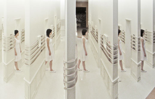
Ironically, the closest example we have of traditional architecture (Ryoji Suzuki’s huge model of a residence) is also the less accessible by the public. In the end – and not surprisingly – the most fun, most attractive and all-round best work is Toyo Ito’s. His 2006 monster exhibition at the Tokyo Opera City Art Gallery was one of the best shows of the last few years and here he keeps entertaining and educating the public with a maze-like environment into which he has crammed all the main techniques he has used in the last years for his projects: from continuous three dimensional tubes to walls curving at cross points and continuous carved arches, all in the name of “organic space.”
Randy Swank
Randy Swank


