An Interview with Christian Kerez
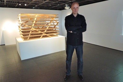
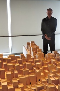
Swiss architect Christian Kerez playfully leans over the large-scale version of a housing unit he designed for a Sao Paulo favela and points to one of the three-story wooden apartment buildings. “This is where I want to live,” he smirks.
The expansive model of Kerez’s Social Housing in Paraisopolis (2009-2014) is currently on display at Gallery Ma along with four other renditions of his most prominent projects, all presented through multi-media platforms displaying each project at every stage of the planning process.
Gallery Ma Chief Curator Kumiko Ikada says Kerez was invited to exhibit at the museum because of his distinctive work, his refusal to adhere to preconceived notions and his ability to simplify the complex, reducing buildings to the primary principles.
“Switzerland is the Mecca of architecture, so to have one of the elite Swiss architects display at our gallery is something special,” says Ikada. “And in some ways Swiss architecture is compatible with Japanese aesthetics. They use simple designs, but give great attention to detail and fine craftsmanship.”

While this is Kerez’s first exhibition in Japan, he has visited four times prior, lecturing in Tokyo and Kyoto. A professor of design and architecture at ETH Zurich, he proclaims to be fascinated, “even obsessed,” with Japanese architecture.
“I would say it is the variety. It’s very experimental,” Kerez says. “You have projects that are as adventurous, as courageous, as different, as nowhere in the world. I would say it’s the most important place for architecture. I feel not only me, but everyone, is really carefully observing what is going on in Japan.”
Subconsciously, Kerez says his past collaborations with Japanese colleagues influenced his design for the Sao Paulo favela. Kerez spent two weeks studying the urban housing complexes of Brazil, which hold a stigma as being slums or ghettoes. However, he was fascinated with the urbanism, and with his winning design, he strove to reflect the culture and conventions of the inhabitants. However, only when the design was complete did he realize the Japanese influence.
“I always try to start from scratch with every project and start with the most basic questions. It isn’t so much from inspiration but more from the analysis of circumstances,” says Kerez. “You could say this is a work that has to do with vernacular Brazilian architecture, the depreciation of the small scale. The obsession with smallness you can also find in this huge residential housing project is surely related to the emulation I have for Japanese architecture. Even if this might look like a favela related to Brazil, the kind of high estimation for these small urban spaces comes very much from Japan.”
Kerez says he is fascinated with the work of Japanese architects such as Kazuyo Sejima and Ryue Nishizawa of SANAA, and his acquaintance Sou Fujimoto, whose use of delicate light structures and permeable enclosures is reflected in some of Kerez’s work such as the Holcim Competence Center (2008).
The design for the Swiss concrete company’s headquarters was to encapsulate the company’s research, education and administration facilities under one roof. To bring all facets of the facility together, Kerez incorporated gaping light wells that branched vertically through each floor, allowing employees to observe the comings and goings of every department.
The high-rise’s exterior embracements are to be constructed of concrete, since it was designed for a concrete manufacturer, but the facade is to be a shimmering glass enclosure. “It is the relationship between the very fragile interior, which is only for the weight, and the totally separated exterior which is only to make the building stiff,” says Kerez. “This looks very playful or abstract, but in the end it’s really about how you define the space and everyday life of the headquarters of a corporation.”

Coinciding with his design of the Holcim complex, Kerez developed the design for its sister high-rise, the Swiss Re Next (2008). This groundbreaking design, which ultimately lost in competition, completely defied convention. Most high-rise buildings have the structural core, which houses the stairway, fire security, utilities, etc. These are generally vertical shafts that limit the creativity of the architect. However, the stairs for the Swiss Re Next don’t follow the structure. The structure follows the movement of the stairs.
“The most boring thing there is in a high-rise is the stair, because it is always the same. Each floor, just turning in circles like a screwdriver. We thought walking up in a building would actually be an interesting experience if you could go on a cascading stair from one facade to another and back. The stair is not a prisoner of the structure,” says Kerez. “It is surprising that it was never done because it is an extremely simple idea. I couldn’t imagine anything more basic. Of course it would be a challenge for the structural engineer to do something like that, but we always work very closely with engineers. It could be done.”
Kerez’s latest unconventional design, the Highrise in Zhengzhou 1 & 2 (2011/20012-2013) has traces of Kazuo Shinohara, who applied architectural theory in an anomalous fashion. The columns of the 120 meter Zhengzhou high-rise will measure in at a mere 15 cm. Instead of having a hierarchical system of columns, Kerez implemented oblique shifted columns, with more loads at the bottom of the structure that decrease with each ascending floor.
To protect the high-rise from side to side motion, Kerez installed tension wires stretching out from the side of the building like tent tethers.
“I would say what interests me is not design in the sense of creating a shape or defining materials, details or colors, I am much more interested in changing the most basic elements there are in architecture. What is a column? What is a slab? How are they connected?” says Kerez. “It’s attention to the genetic code of the building rather than say, the cosmetics of a building, or plastic surgery. Not the skin, but the bones, is the target of the design.”
The fifth model on display at Gallery Ma is perhaps Kerez’s most notorious project, the Museum of Modern Art in Warsaw (2006-2012). Like most of his projects, the Warsaw MoMA design is composed of two elements, this being in the overlap of the two roof structures. One roof structure is supported with columns and beams on the ground floor like the profane roof of a city square, while the other is vaunted.
“We designed certain spaces to be a provocation for artists. In this form, these are spaces that do not exist yet, so it would be great to challenge the artists to create artwork for specific spaces,” says Kerez.
While the Warsaw project dragged on for seven years, with Kerez being forced to wrangle with several political and public factions, the plan was ultimately put on hold when it was discovered the city of Warsaw did not own the land.
Kerez will travel to Brazil in two months to hopefully move forward with the social housing development, however, he said political upheavals have caused delays and barriers there as well.
While he has never built in Japan, Kerez says the “intellectual generosity” of the country nurtures the flourishing architectural scene. “Here in Tokyo, I feel there is an individuality which is very rare. Even if you look at post-modern Japanese architecture, I think it is much more experimental than anywhere else,” says Kerez. “Maybe it’s easier to make experiments in a small scale rather than a large scale, which is the experience I am going through now. I built some rather small houses in Switzerland and now I am trying to enter a new scale, and this is quite difficult. Working in other countries is interesting because it makes you see things in different ways. It makes you re-evaluate what you know already, and it also in the end brings you to new concepts, new ideas.”
***Christian Kerez “The Rule of the Game” runs until September 28. Gallery Ma will be closed for summer holidays August 11-19.
Nick Narigon
Nick Narigon


