In Pursuit of Less
There is something quite confounding about Shinya Aota’s first exhibition at Aoyama | Meguro, with the installation and indeed the individual works constructing a simultaneous process of familiarisation and defamiliarisation. Upon approaching the gallery, with its vast street frontage windows, the site could initially be read as a minimalist boutique for designer objects. Swathed in fluorescent lighting the individual works are formally arranged at an almost architectural equidistance from one another, connoting the impression of discriminative availability.

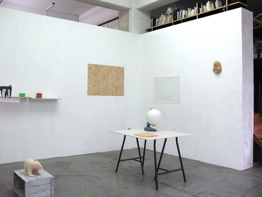
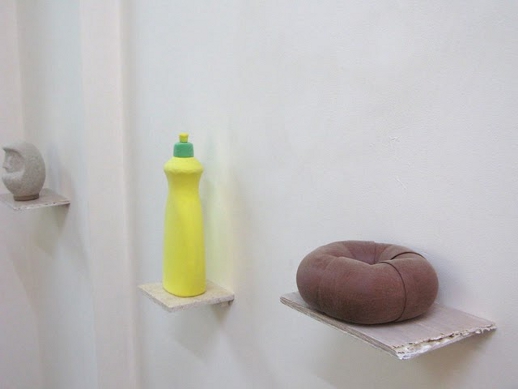
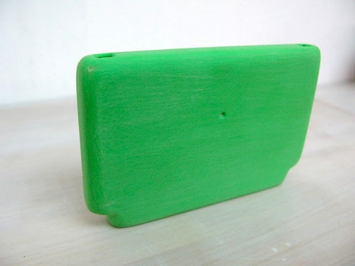
Yet the works reveal themselves to be an almost banal assortment of everyday objects, with among other items, a baseball bat, a pair of spectacles, a football, a globe, and various vessels that had perhaps contained domestic cleaning products. This is not a Duchampian gesture of inserting the readymade within the gallery context, for the works are not merely found objects recontextualised to raise questions of aesthetic and institutional evaluation. All of the items within the project have been neutered in terms of their origin and in some instances, their functionality, with all traces of their surfaces removed beyond recognition. The works have undergone what would appear to be painstaking process of sanding back, erasing all trace of brand identification while retaining the sense of the form, as an almost Platonian gesture of idealism.

Through this process, the project operates as a refutation of market driven consumerism, as it destabilises the objects’ relationships to the mechanisms of marketing and brand recognition. What may be a pair of Prada spectacles becomes merely a set of spectacles and what may be a Sonic Youth album becomes merely an album and so forth. All histories, connotations and associative points of the objects are nullified as they become merely forms, ubiquitous forms to represent all objects that share those characteristics. Through this process the objects also cease to function, for in many instances their surface is intrinsic to the identifiable use or value of the object.

This is perhaps most evident in a poster, which originally, although this is barely apparent, was a map of the world, having had all traces of its representation sanded back so that it exists as a rough surfaced blank sheet of paper. The work is presented in relation to a globe, which although obviously recognisable in form, serves no functional role in terms of determining geographical relationships. The erased world map poster is flanked by what is one of the most striking of works within the exhibition, a work which replicates the scale of the neighbouring poster, yet goes further to embed the exhibition within its current context. A rectangular surface of the gallery wall has been carefully sanded back to reveal the original material, cost efficient wood chipped board. In so doing, the work strips away the varied history of exhibitions within the gallery contained within the layers of paint, exposing the construction and materiality of the gallery’s architectural configuration. This work perhaps epitomises many of the concepts within the exhibition, the pursuit of reductionism, of bringing formal concerns to the fore and of estranging us from the hierarchical structures of brand determination.
Mark Feary
Mark Feary


