If you cut into the present, the future leaks out
Here’s a visual statement for you: a battered stainless steel cube, smashed in at the top by a sledgehammer. Reading curator Li Edelkoort’s accompanying manifesto, one can imagine her as the one who wielded the weapon: “Time has come for extreme change. Society is now ready to break away from the last century for good. To break from creative conventions, theoretic rules and stigmas that are now questioned.”
The chair is to design what the silhouette is to fashion; constrained only by the simplest of definitions, it reflects the Zeitgeist in its countless innovations and permutations. It is therefore the most effective way to illustrate this conceptual break. This cube may be dented, but it still has the brazen cheek to break the very definition of a chair; you cannot sit on it. It is merely posing as a chair, much like a chihuahua poses as a dog. Is this what the future of design looks like?
Edelkoort, a trend-spotter by trade, thinks so. Prescient to the subtle shifts taking place within the design world, she has compiled this exhibition as evidence of the quiet revolution that unfurled in the wake of the financial crisis. The works on display are meant to sever from the pre-crisis trend for “glamorous and streamlined design for design’s sake”, and embrace a “more modest, content and contained lifestyle” instead. Can the goods stands up to the hyperbole?

The first room leaves me undecided. Not helping is the intensely annoying video installation, ‘Schlampfen’, playing what sounds like a frantically screamed train announcement on repeat (credits for the gallery staff’s headaches go to Hessel Stuut). It provides a rather twisted soundtrack to the entirely black and somewhat sinister works on display. There is a melting chair (‘Liquid Pillows’) in the Dali tradition; a huge wardrobe with shoes ominously straining at its surface to escape, and the ‘Fat Knit Hammock’, an enormous sausage of woven ropes whose latex coverings wouldn’t be out of place in a sex shop. The “Mixed Animals” series of teddy bears reminds me of those other stuffed love-children of counter-culture and brands; the Louis Vuitton x Takashi Murakami toys, or the Sex Pistols’ Never Mind the B*llocks” bear.
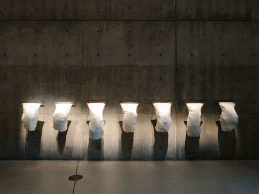
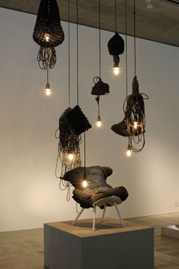
Downstairs, the tone shifts from the foreboding to the animalistic. Skin features heavily, from the bulging beautified trash bags of Laura Lynn Jansen’s ‘Wastesthetics’, to Willem Deridder’s stretched hide stools with protruding spines and ribs cages. malousebastiaan’s (sic) ‘Floating Garments’, bring to mind surrealist Hans Bellmer’s grotesque dolls, with their bulbous breast-like growths and globular structure. There is a heavy “African” flavour to the room, thanks to the lazy cliché that the continent is somehow more connected to primal nature than elsewhere. Like students with bongos, designers think they can merely use superglue a bit of dried animal hide to something brown and call it “African”. A case in point are the two ugly creature sculptures in the centre of the room, emitting tribal drum beat music from their mouths. Invented and historyless, they strike me as cheesy and inauthentic as fiberglass statues in a Lion King-themed Disney restaurant.

More successful are the various leather objects that implore the observer to consider their origin; a cow-shaped poof, a cow chair, and even the comically named ‘Rocky’, a leather punch bag in the shape of a beheaded bovine carcass. The latter, while too self-consciously slick to be a convincing ethical argument, does provoke a giggle. Design might have got its sense of humour around the nineties, when it caught the giggles from modern art, but it was not until the noughties that more and more designers put their tongue in their cheeks before they started drawing.
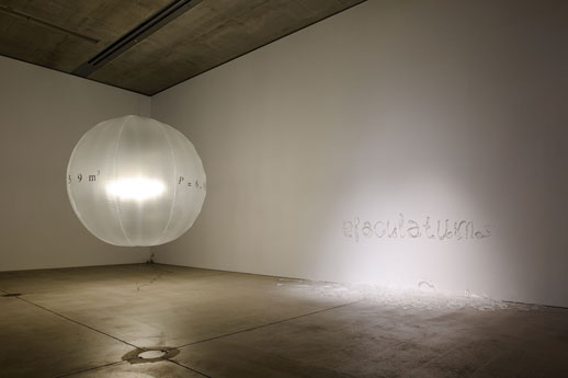
Two other works that coax a smile are Els Woldhek’s ‘Bastard’, a beaten lump of cushion-on-legs styled as a “cross-bred chair,” and ‘Eiaculatum’ by Anthon Beeke, a “semen alphabet executed in glass” that is as interesting as it sounds. Nearby, Eric Klarenbeek’s ‘Floating Light Project’, an enormous balloon, cleverly inflates and deflates as the light bulb inside is turned on and off, like an electric fugu.
 The latter and some other works would be some of the most beautiful and thought-provoking art I have seen for a while, if they weren’t classified as “design”. But it seems that the line between the two disciplines is becoming more nominal than ever. Both designers and artists often aspire for their works to end up in the same money-making graveyards of hotel or office lobbies. Moreover, the boom in eco-friendly products means design is no longer merely concerned with its traditional pillars of aesthetics and function; it has become political, too. To me, “eco-friendly design” has always seemed something of an oxymoron, since the production of anything — recycled goods included — consumes more energy and resources than it can possibly save. Edelkoort, however, has no truck for such churlish anti-consumerism; she claims that design needs to strive for a more “mature philosophy” than the “naïve and aspiring ecological language” that has characterized previous efforts. While I find her statements vague, I presume that she means that products must be judged on from a design perspective rather than just their “eco” credentials.
A more common theme in this exhibition is the lack of respect for convention, as the crushed chair at the beginning signified. The old principles do not have to be abided by.
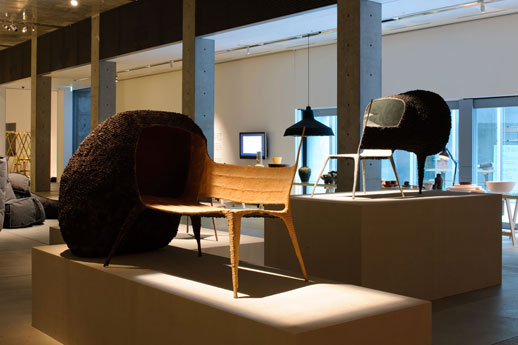
Aesthetics, function and carbon footprints therefore jostle for priority. Nacho Carbonell’s chairs are completely impractical; moulded out of a thin sheet of recycled paper pulp, they wouldn’t support a gnat. Taken merely as a sculptural work, however, their Giacometti-esque fragility redeems them. Johannes Hemann, on the contrary, makes the same mistake as a lot of the eager eco brigade by making something that is purely ugly; a recycled cork coffee table that looks suspiciously like the waste product of a cow.
I was cheered by Vincent Geraedts’ cutely named ‘PS; I’m a Chair’, which I thought had finally successfully achieved the holy triumvirate of good looks, utility and eco-friendliness. Then I realized that it owed its lightweight durability to oil-derived polystyrene (tut tut). Ronel Joordaan and Bas van der Veer sneaked the prize instead, with their renewable bioplastic and felt planters that are so simple and logical that every other alternative seems ridiculous.
While the large-scale objects might steal the show, the beautifully crafted cornucopia of ceramics, glassware and utensils scattered along the side table deserve a mention too. Boasting a craftsmanship and durability that this new kind of design seems to take for granted, they are all gorgeous, covetable objects. If the show does achieve avoid streamlined glamour, it does so by reclaiming old-fashioned sculptural elegance instead. The matching of sturdy wooden handles with delicate kettles and liquid containers in Dick van Hoff’s ‘Glasswork’ is stunning. Joris Laarman’s spindly ‘Bone Chair’ likewise resembles a delicate, ethereal animal while being ergonomically balanced.

As one would expect for a design exhibition set in such an overtly avant garde setting as 21_21 Design Sight, this exhibition is neither a trade show, a design expo or the vehicle for an impassioned environmental project. The common thread running through all the pieces, however, is a somewhat deeper relationship with nature. Yet rather than implying a desire to protect it or leave it alone, a la PETA, this involves an omnivorous celebration of the historical and intimate relationship between humans, animals and plants. If the works aren’t literally made of the latter, then they mimic or reference their forms. Table legs are spindly like deers; shelves are wonky, ornaments are bone-shaped. Although the title of the exhibition confused me before I saw it — how do you excavate the future? — these pieces made sense of it. They embody the values of simplicity, tradition and frugality, all of which were revived in the recent recession. If “Post Fossil” doesn’t look much like a revolution, it’s because its vision of the future is not tinfoil space suits and automated furniture, but rather a fusion of past and present.
Sophie Knight
Sophie Knight


